Coloring Outside the Lines
Does artwork need to be perfect to be considered great?
I mean, I certainly used to think so. That’s why I spent over ten years toiling to make my drawings appear perfectly identical to my reference photos. I’ve been told all my life to color inside the lines, to portray accurate proportions, to create clean line work, to match the colors and values perfectly. But now I’m being challenged to... intentionally break these rules? But why?
My drawing professor recently assigned “course textbook” reading. What I found in this particular book wasn’t a list of rules; instead, it contained example after examples of urban sketches by a variety of artists. I examined each of the drawings in this book and noticed a common factor throughout the different artists’ work…
They kept breaking the rules. You might be wondering what I mean by this statement. Well for starters:
They colored OUTSIDE the lines.
They EXAGGERATED proportions.
Their linework was SHAKEY.
The colors they chose WEREN’T REALISTIC.
But wait… these artists are masters of their craft. Why is it suddenly okay for them to break the rules?
The answer is simple, actually.
It’s very apparent they know the fundamentals of art, yet they strategically bend these rules in their favor. It’s not that they don’t know how to color inside the lines; rather, they are simply choosing not to color inside the lines. They break the rules to elevate a certain aspect of their work. This so called “aspect” is commonly referred to as “artistic voice.”
Additionally, they focused on making visually consistent sketches opposed to “perfect” sketches. If their linework was shaky, they made sure to apply this same technique throughout the sketch. Likewise, if their work contained areas where the watercolor wandered outside the lines, they made sure to consistently apply that style throughout the piece to make it visually intentional.
When an artist is at the beginning of their journey, it’s imperative that they learn and apply the fundamental principles of design. They must never veer from this path of instruction… until they, too, have mastered the fundamentals.
A beginner will often break the rules because they don’t understand the rules; whereas a master artist will break the rules because they understand that “strictly following the principles of design” will obstruct their path to fully expressing their artistic voice. I’ve observed that master artists aren’t just “breaking rules” for the sake of “breaking the rules.” There’s always intentionality behind their decisions to elevate the quality of their work.
I suppose perfection alone doesn’t make an artwork “great.” Perhaps, consistency in style and application is truly what makes a piece successful?
So, where am I placed on the scale of “beginner” to “master?” Candidly, I would place myself somewhere between the two. I’ve learned and applied the fundamental rules of drawing, but now I’m at the place in my journey where I’m learning how to strategically “break the rules” for the sake of elevating the visual appeal of my work.
Right now, I’m at that awkward stage where things aren’t exactly “clicking.”
But that’s okay, because I’ll have the rest of my life to figure it out. For now, I’ll have to be okay with my work appearing awkward until I’m confident in my approach.
Application
Sketch #1:
“Applying ‘correct’ colors” was the rule I focused on breaking during the baseball field sketch. My goal for this piece was to push vibrancy and integrate certain colors that weren’t necessarily present in real life. For example, I added a lot of purple to the shadows (even though they didn’t exist in the location I was drawing) and colored the grass a lime green shade (it was much darker in real life).
So why did I break this rule and add a color that wasn’t in my reference?
Answer: Because I knew it’d look pretty…
:D
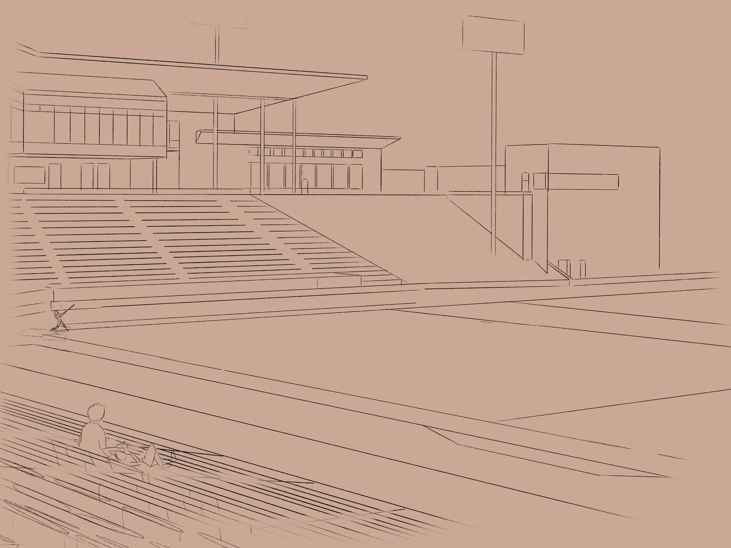
Initial Sketch
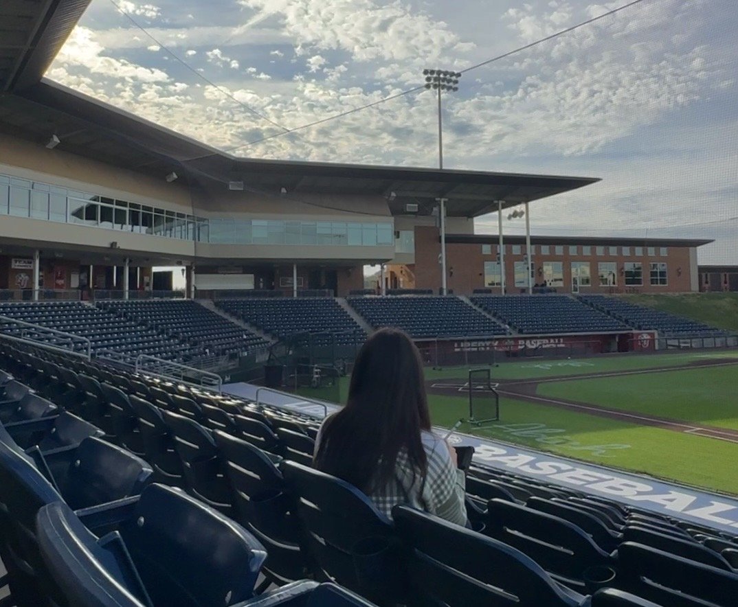
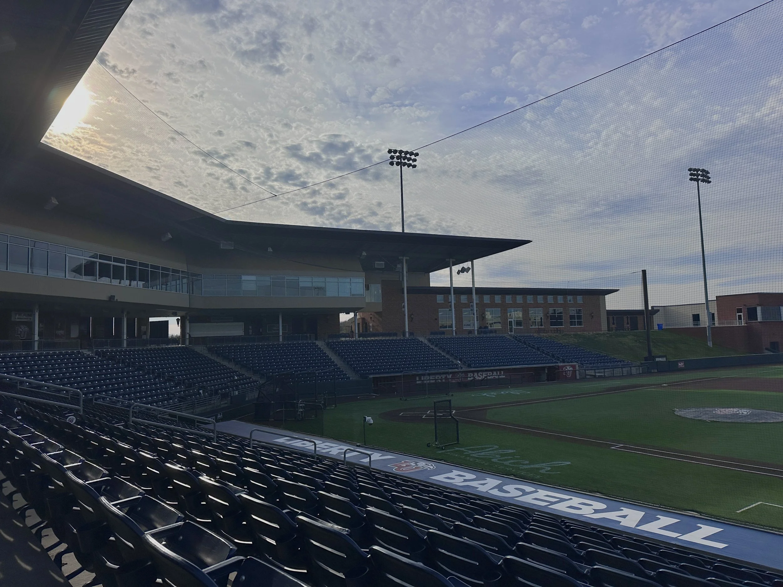
My goal for this piece wasn’t to replicate what I saw; rather, my objective was to communicate a warm narrative. Technically, there wasn’t anyone with me while I drew in this giant, empty stadium. I was also freezing while I drew. However, I didn’t want the viewer to feel sad, lonely, and cold about the emptiness… because I certainly didn’t feel that way about my surroundings. Therefore, I pushed the warmer colors and added spectators to change the mood of the piece in my favor.
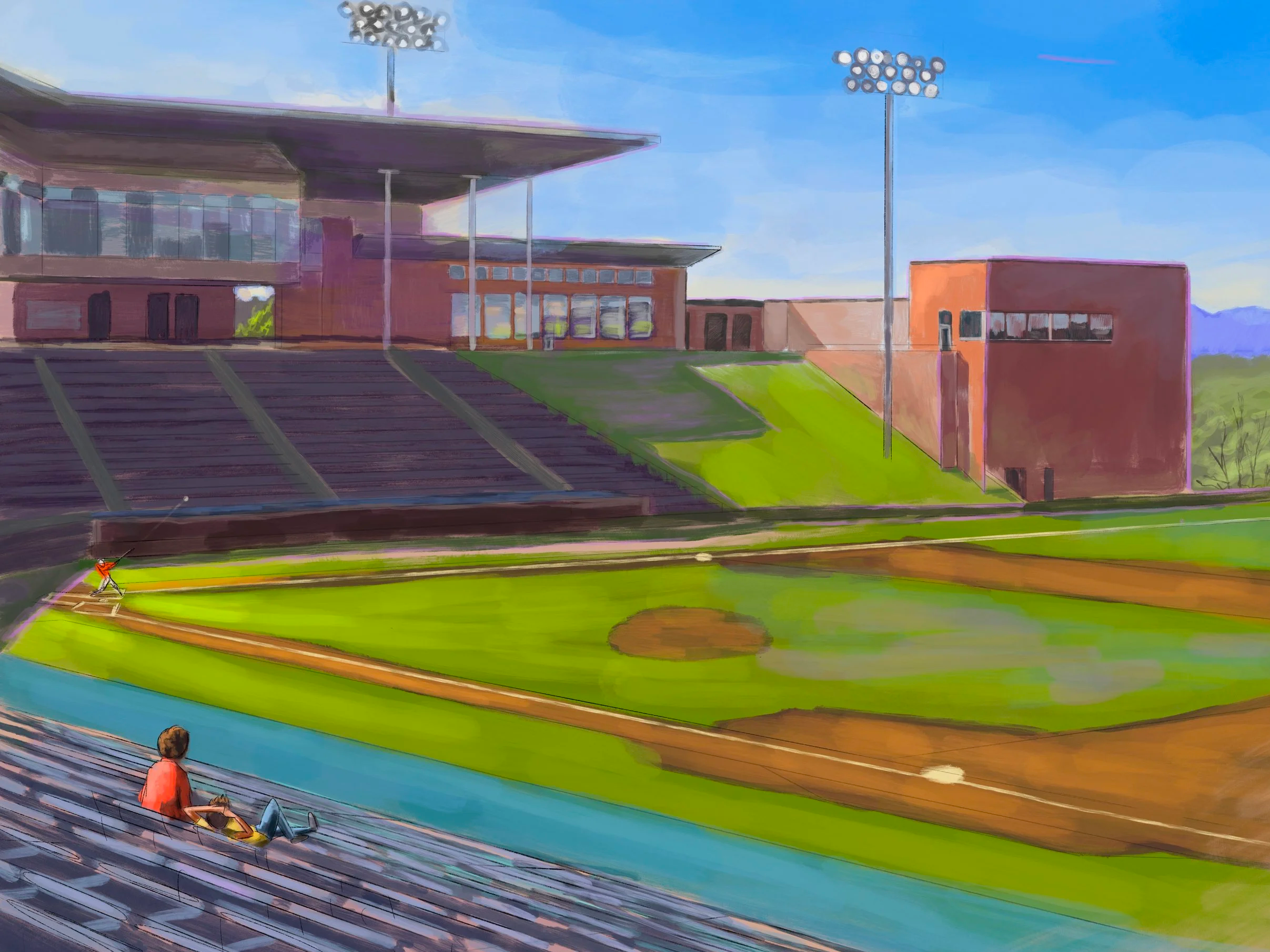
Final Result: Created on “Procreate” Drawing App
Sketch #2:
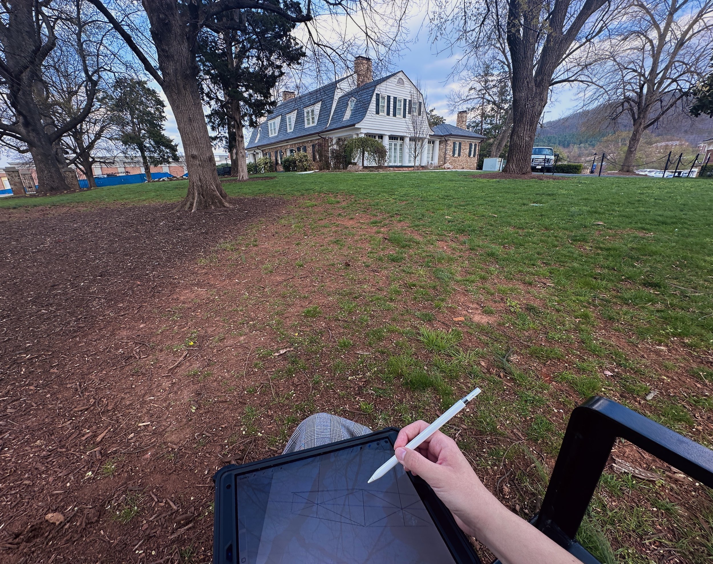
For my second sketch, I was primarily focused on replicating what I saw. You caught me… I kind of retreated to what I felt safe doing. Whoops. Therefore, the objective of this piece was to exercise correct perspective.
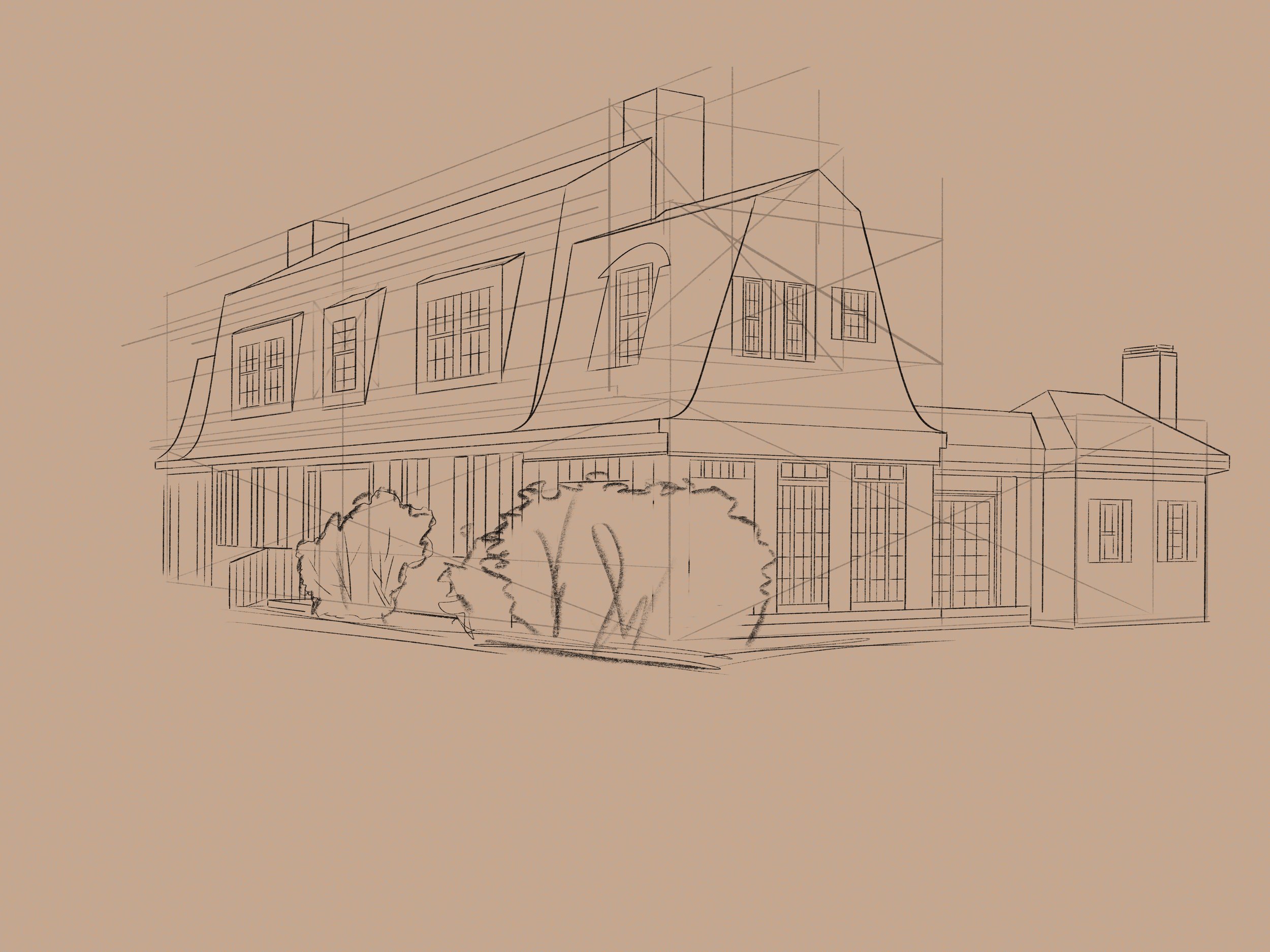
Initial Sketch
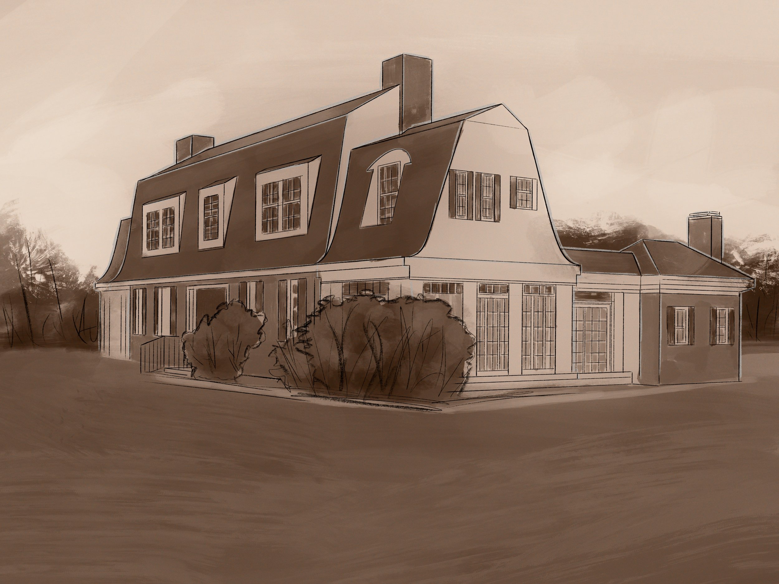
Final Sketch: Completed on “Procreate” Drawing App